Repetition or variation?
One of the primary features of Dutch building design has been uniformity. Organized development, democratic sentiments, planning regulations and related factors resulted into repetitive patterns, characterized mostly by translational symmetry, with mirror symmetries sometimes thrown in. Repetition is a powerful device that transforms picturesque scales and morphologies into something more urban and modern, even from rather early in Dutch architecture, as on the Groot Heiligland in Haarlem.


Repetition has dominated Dutch urban development, especially in the suburbs that have filled the country since the 1930s. Local authorities enforced it rigorously, imposing uniformity even in small modifications like loft conversions, especially on the street side: the morphology of a neighbourhood had to be preserved, and buildings of the same row had to remain identical, sometimes even in the colours they used.
More recently, however, planners have had a change of heart. Uniformity was deemed not just oppressive, resulting into anonymity (people had been joking that the only way they could find their own place was by counting houses or from the curtains) but also aesthetically and historically wrong. They pointed out that the most interesting urban places were characterized by variety, with buildings of various shapes, sizes and materials coming together into a harmonious whole, as in these pictures of Bergen-op-Zoom.

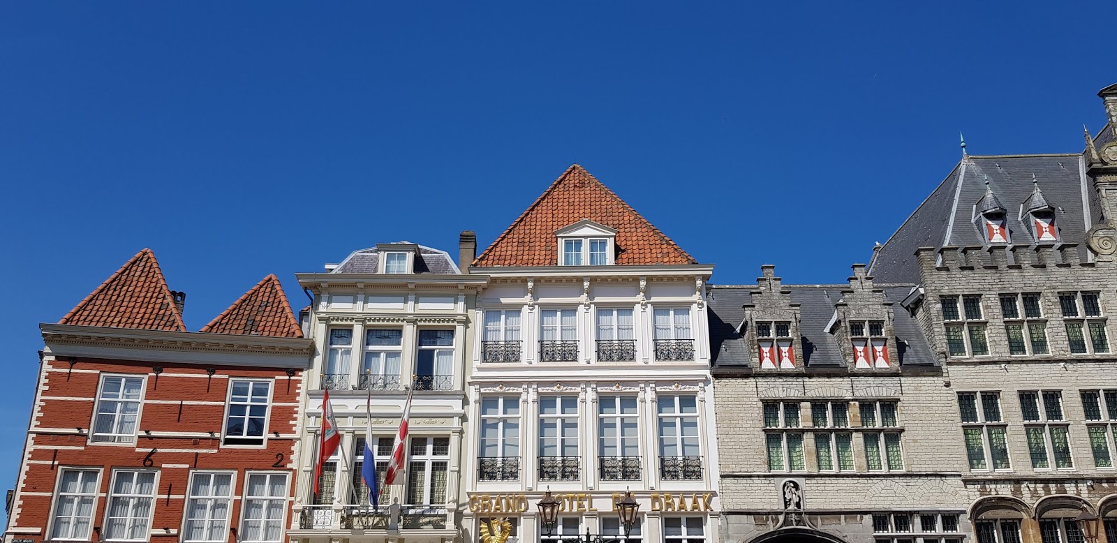
One could point out that these buildings were designed and constructed in different eras, under different conditions (including planning regulations) and that buildings may come together in clumsy ways but the idea of variation seems to have caught on. More and more new developments take place under regulations that stipulate that adjacent buildings should have different floor levels, fenestration patterns, roofs and textures or colours.


Some of the results are not uninteresting but in others variation is forced and superficial, making me long for uniformity. From a research point of view, it's an open invitation to study the perception of buildings and the effects of formal devices like translational symmetry on aesthetics. There used to be quite a few psychologists who were keen on the foundations of such perception. I'll keep on collecting examples, good and bad, and perhaps some time I'll try to make the connection with aesthetics and perception. It's a development worth following.


